Card
A flexible container component for grouping related content. Supports 5 visual variants, composable header/footer/media slots, clickable behavior, hover animations, and responsive padding options powered by Framer Motion.
Live Preview
Interact with the Card component in real time. Adjust variant and padding to see changes instantly.
Card Title
A brief description of this card
This is the card body content. It can contain any React nodes including text, images, forms, or other components.
1<Card2variant="default"3padding="md"4header={<CardHeader title="Card Title" subtitle="A brief description" />}5footer={<span>Updated 2 hours ago</span>}6>7<p>Card body content goes here.</p>8</Card>Installation
Install the Aidash Components package using your preferred package manager.
$ pnpm add @aidash/componentsImport
Import the Card and its subcomponents into your file.
import { Card, CardHeader, CardMedia, CardFooter } from '@/components/aidash/card';Usage
The simplest way to use Card with default props.
A simple card with default styling and padding.
With Header
Composable slots
Card with a header component.
1<Card>2<p>A simple card with default styling.</p>3</Card>4 5<Card header={<CardHeader title="With Header" subtitle="Composable slots" />}>6<p>Card with a header component.</p>7</Card>Variants
Five visual variants for different emphasis levels and contexts.
default
Default Card
variant="default"
This card uses the default variant style.
bordered
Bordered Card
variant="bordered"
This card uses the bordered variant style.
elevated
Elevated Card
variant="elevated"
This card uses the elevated variant style.
glass
Glass Card
variant="glass"
This card uses the glass variant style.
gradient
Gradient Card
variant="gradient"
This card uses the gradient variant style.
1{/* Default — standard border */}2<Card variant="default">...</Card>3 4{/* Bordered — brand-colored border */}5<Card variant="bordered">...</Card>6 7{/* Elevated — with shadow */}8<Card variant="elevated">...</Card>9 10{/* Glass — frosted glass effect */}11<Card variant="glass">...</Card>12 13{/* Gradient — subtle brand gradient */}14<Card variant="gradient">...</Card>default for standard content sections, elevated for featured items, and glass for overlay-style cards on busy backgrounds.Tones
Semantic tints for status cards — orthogonal to variant. Combine with any variant to signal success, warning, danger, or info.
Deploy Successful
v2.4.1 shipped to production
All 128 checks passed. Rollout completed in 3m 12s.
Quota at 82%
Monthly API limit
You are approaching your plan's API quota. Consider upgrading before the end of the month.
Payment Failed
Card ending 4242
The renewal charge was declined. Update your billing method within 7 days.
New Beta Feature
Available to Pro users
Try our new AI-powered code review — enable it in project settings.
Elevated + Success
Tones compose with variants
Any variant can be combined with any tone.
Bordered + Danger
Emphasis on critical state
Use bordered + a strong tone for cards that require attention.
1<Card tone="success" header={<CardHeader title="Deploy Successful" />}>...</Card>2<Card tone="warning" header={<CardHeader title="Quota at 82%" />}>...</Card>3<Card tone="danger" header={<CardHeader title="Payment Failed" />}>...</Card>4<Card tone="info" header={<CardHeader title="New Beta Feature" />}>...</Card>5 6// Tones compose with any variant7<Card variant="elevated" tone="success">...</Card>8<Card variant="bordered" tone="danger">...</Card>tone only tints border + a subtle background. For higher-emphasis status messaging (banner-style), use Alert instead.Padding
Four padding options to control the internal spacing of card content.
none
padding="none" (no padding)
sm
padding="sm" (p-4)
md
padding="md" (p-5)
lg
padding="lg" (p-6)
1<Card padding="none">No padding</Card>2<Card padding="sm">Small padding (p-4)</Card>3<Card padding="md">Medium padding (p-5, default)</Card>4<Card padding="lg">Large padding (p-6)</Card>Features
Advanced capabilities including CardHeader, CardMedia, footer, clickable cards, and hover effects.
CardHeader with Title, Subtitle & Action
Project Overview
Last updated 3 minutes ago
A card with a fully-featured header including title, subtitle, and an action button.
1<Card2header={3 <CardHeader4 title="Project Overview"5 subtitle="Last updated 3 minutes ago"6 action={<button><MoreIcon /></button>}7 />8}9>10<p>Card body content.</p>11</Card>CardMedia with Aspect Ratios

video (16:9)

square (1:1)

wide (21:9)
1<Card media={<CardMedia src="/image.jpg" alt="Cover" aspectRatio="video" />}>2<p>16:9 aspect ratio</p>3</Card>4 5<Card media={<CardMedia src="/image.jpg" alt="Cover" aspectRatio="square" />}>6<p>1:1 aspect ratio</p>7</Card>8 9<Card media={<CardMedia src="/image.jpg" alt="Cover" aspectRatio="wide" />}>10<p>21:9 aspect ratio</p>11</Card>Footer + CardFooter Subcomponent
Monthly Report
January 2026
The footer area is separated by a top border and pinned to the bottom of the card. Use CardFooter with align="start | between | end" for consistent action-row layouts.
1<Card2header={<CardHeader title="Monthly Report" subtitle="January 2026" />}3footer={4 <CardFooter align="between">5 <span>3 attachments</span>6 <div className="flex gap-2">7 <button>Share</button>8 <button>Download</button>9 </div>10 </CardFooter>11}12>13<p>Card body content.</p>14</Card>Clickable Cards
Click Me
onClick handler
This card has an onClick handler and shows a pointer cursor.
Link Card
Renders as anchor
This card renders as an anchor element with href.
1{/* With onClick */}2<Card clickable onClick={() => console.log('clicked')}>3<p>Click handler card</p>4</Card>5 6{/* With href */}7<Card href="/dashboard">8<p>Link card</p>9</Card>Hover Effects
Hover Enabled
hoverEffect={true}
Hover over this card to see the lift effect (default).
Hover Disabled
hoverEffect={false}
This card has no hover animation.
1{/* Enabled (default) */}2<Card hoverEffect={true}>Lifts on hover</Card>3 4{/* Disabled */}5<Card hoverEffect={false}>No hover animation</Card>Composition
Real-world composition patterns combining Card with other components.
Dashboard Card
Revenue
This month
$48,352
75% of monthly target
1<Card2variant="elevated"3header={4 <CardHeader5 title="Revenue"6 subtitle="This month"7 action={<span className="text-success-500">+12.5%</span>}8 />9}10>11<p className="text-2xl font-bold">$48,352</p>12<div className="h-1 rounded-full bg-gray-200">13 <div className="h-full bg-brand-500 w-3/4" />14</div>15<p className="text-xs">75% of monthly target</p>16</Card>Profile Card
Alex Parker
Senior Frontend Engineer
1<Card variant="glass" padding="lg">2<div className="flex flex-col items-center text-center">3 <Avatar name="Alex Parker" size="lg" />4 <h3>Alex Parker</h3>5 <p>Senior Frontend Engineer</p>6 <BadgeGroup>7 <Badge color="primary">React</Badge>8 <Badge color="primary">TypeScript</Badge>9 </BadgeGroup>10</div>11</Card>Pricing Card
Everything you need to build at scale.
- Unlimited projects
- Priority support
- Advanced analytics
- Custom domains
- Team collaboration
1<Card2variant="gradient"3padding="lg"4footer={<button>Get Started</button>}5>6<span className="badge">Pro</span>7<p className="text-3xl font-bold">$29<span>/month</span></p>8<ul>9 <li>Unlimited projects</li>10 <li>Priority support</li>11 <li>Advanced analytics</li>12</ul>13</Card>Product Card
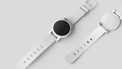
Minimal Watch
Premium stainless steel with leather strap
1<Card2variant="elevated"3media={<CardMedia src="/product.jpg" alt="Product" />}4footer={5 <div className="flex justify-between">6 <span>$49.99</span>7 <button>Add to Cart</button>8 </div>9}10>11<h3>Minimal Watch</h3>12<p>Premium stainless steel</p>13<StarRating value={4} />14</Card>Accessibility
Built-in accessibility features for inclusive user experiences.
Semantic Roles
Interactive cards automatically receive role="button" and tabIndex=0 for keyboard accessibility. Link cards render as native <a> elements.
Keyboard Navigation
Clickable cards support Enter and Space key activation, matching native button behavior. Focus is managed through the browser's default tab order.
Media Alt Text
The CardMedia component requires an alt prop for screen reader compatibility. Always provide descriptive alternative text for images.
Motion Preferences
Hover animations are powered by Framer Motion which respects the prefers-reduced-motion media query. Users who prefer reduced motion will see instant transitions.
1{/* Interactive card with keyboard support */}2<Card clickable onClick={() => openDetail(id)}>3<CardHeader title="Accessible Card" />4<p>Press Enter or Space to activate</p>5</Card>6 7{/* Link card renders as <a> */}8<Card href="/projects/123">9<CardHeader title="Project Link" />10</Card>11 12{/* Media with descriptive alt text */}13<Card media={<CardMedia src="/photo.jpg" alt="Team meeting in the conference room" />}>14<p>Card with accessible media</p>15</Card>API Reference
Complete list of props accepted by Card, CardHeader, and CardMedia.
| Prop | Type | Default | Description |
|---|---|---|---|
| variant | 'default' | 'bordered' | 'elevated' | 'glass' | 'gradient' | 'default' | Visual style of the card |
| tone | 'default' | 'success' | 'warning' | 'danger' | 'info' | 'default' | Semantic tint applied over the variant (border + subtle bg) |
| header | ReactNode | — | Content rendered in the card header area |
| children | ReactNode | — | Main body content of the card |
| footer | ReactNode | — | Content rendered in the card footer area with a top border |
| media | ReactNode | — | Media element (image, video) rendered above or below content |
| mediaPosition | 'top' | 'bottom' | 'top' | Position of the media element relative to content |
| clickable | boolean | false | Makes the card appear interactive with cursor pointer |
| onClick | () => void | — | Click handler for the card |
| href | string | — | Renders the card as an anchor link |
| className | string | '' | Additional CSS classes |
| padding | 'none' | 'sm' | 'md' | 'lg' | 'md' | Internal padding of the card content areas |
| hoverEffect | boolean | true | Enable lift and shadow animation on hover |
| Prop | Type | Default | Description |
|---|---|---|---|
| title | string | — | Primary heading text |
| subtitle | string | — | Secondary description text below title |
| action | ReactNode | — | Action element rendered on the right side (button, icon, etc.) |
| className | string | '' | Additional CSS classes |
| Prop | Type | Default | Description |
|---|---|---|---|
| src | string | — | Image source URL |
| alt | string | — | Image alt text for accessibility |
| aspectRatio | 'video' | 'square' | 'wide' | 'video' | Aspect ratio of the media container |
| className | string | '' | Additional CSS classes |
clickable and href are provided, the card renders as an <a> element. The onClick prop takes precedence for button-style interactions.Examples
Realistic production examples showing cards in context.
Dashboard Layout
12,847
+8.2% from last month
$84,230
+14.5% from last month
3.24%
-1.2% from last month
1<div className="grid grid-cols-3 gap-4">2<Card variant="elevated" padding="sm">3 <span>Total Users</span>4 <p className="text-xl font-bold">12,847</p>5 <span className="text-success-500">+8.2%</span>6</Card>7<Card variant="elevated" padding="sm">8 <span>Revenue</span>9 <p className="text-xl font-bold">$84,230</p>10 <span className="text-success-500">+14.5%</span>11</Card>12<Card variant="elevated" padding="sm">13 <span>Conversion</span>14 <p className="text-xl font-bold">3.24%</p>15 <span className="text-danger-400">-1.2%</span>16</Card>17</div>Settings Panel
Email Notifications
Receive email updates about your account activity
Push Notifications
Get push notifications on your mobile device
Two-Factor Authentication
Add an extra layer of security to your account
1{settings.map((setting) => (2<Card key={setting.title} variant="bordered" padding="sm">3 <div className="flex items-center justify-between">4 <div>5 <p className="font-medium">{setting.title}</p>6 <p className="text-muted">{setting.desc}</p>7 </div>8 <Toggle checked={setting.enabled} onChange={...} />9 </div>10</Card>11))}Product Grid

Wireless Headphones
$129

Smart Speaker
$79
1<div className="grid grid-cols-2 gap-4">2{products.map((product) => (3 <Card4 key={product.name}5 clickable6 onClick={() => openProduct(product.id)}7 media={<CardMedia src={product.img} alt={product.name} />}8 padding="sm"9 >10 <h4>{product.name}</h4>11 <p>{product.price}</p>12 </Card>13))}14</div>Best Practices
Guidelines for using cards effectively in your interface.
- Use consistent variant styles within the same section or layout
- Use CardHeader for structured title/subtitle/action layouts
- Provide descriptive alt text for all CardMedia images
- Use the footer slot for actions that apply to the entire card
- Use href instead of onClick when the card navigates to a URL
- Disable hoverEffect on static, non-interactive cards for clarity
- Nest cards inside cards without visual separation
- Mix multiple variant styles in the same grid or list
- Use padding="none" without adding your own spacing in children
- Put interactive elements (buttons, links) inside a clickable card
- Omit alt text on CardMedia images
- Use glass variant without a visually interesting background behind it
Source Code
Full source code for the Card, CardHeader, and CardMedia components.
'use client';

import { motion } from 'framer-motion';
import { type ReactNode } from 'react';

export type CardVariant = 'default' | 'bordered' | 'elevated' | 'glass' | 'gradient';
export type CardTone = 'default' | 'success' | 'warning' | 'danger' | 'info';

export interface CardProps {
  variant?: CardVariant;
  tone?: CardTone;
  header?: ReactNode;
  children?: ReactNode;
  footer?: ReactNode;
  media?: ReactNode;
  mediaPosition?: 'top' | 'bottom';
  clickable?: boolean;
  onClick?: () => void;
  href?: string;
  className?: string;
  padding?: 'none' | 'sm' | 'md' | 'lg';
  hoverEffect?: boolean;
}

const variantStyles: Record<CardVariant, string> = {
  default: 'bg-(--surface-elevated) border border-(--border)',
  bordered: 'bg-(--surface-elevated) border-2 border-brand-500/20',
  elevated: 'bg-(--surface-elevated) border border-(--border) shadow-(--shadow-card)',
  glass: 'bg-(--surface-elevated)/60 backdrop-blur-xl border border-(--border) shadow-(--shadow-card)',
  gradient: 'bg-linear-to-br from-brand-500/5 via-(--surface-elevated) to-brand-300/5 border border-brand-500/10',
};

const toneStyles: Record<CardTone, string> = {
  default: '',
  success: 'border-success-500/40 bg-success-500/[0.03]',
  warning: 'border-warn-500/40 bg-warn-500/[0.03]',
  danger:  'border-danger-500/40 bg-danger-500/[0.03]',
  info:    'border-brand-500/40 bg-brand-500/[0.03]',
};

const paddingStyles: Record<string, string> = {
  none: '',
  sm: 'p-4',
  md: 'p-5',
  lg: 'p-6',
};

export function Card({
  variant = 'default',
  tone = 'default',
  header,
  children,
  footer,
  media,
  mediaPosition = 'top',
  clickable = false,
  onClick,
  href,
  className = '',
  padding = 'md',
  hoverEffect = true,
}: CardProps) {
  const isInteractive = clickable || !!onClick || !!href;

  const cardContent = (
    <>
      {media && mediaPosition === 'top' && (
        <div className="overflow-hidden rounded-t-xl">
          {media}
        </div>
      )}
      {header && (
        <div className={`${padding !== 'none' ? paddingStyles[padding] : 'px-5 pt-5'} ${media && mediaPosition === 'top' ? 'pt-4' : ''}`}>
          {header}
        </div>
      )}
      {children && (
        <div className={`${paddingStyles[padding]} ${header ? 'pt-0' : ''} ${footer ? 'pb-0' : ''}`}>
          {children}
        </div>
      )}
      {media && mediaPosition === 'bottom' && (
        <div className="overflow-hidden rounded-b-xl">
          {media}
        </div>
      )}
      {footer && (
        <div className={`${padding !== 'none' ? paddingStyles[padding] : 'px-5 pb-5'} ${children ? 'pt-0' : ''} border-t border-(--border) mt-auto`}>
          <div className="pt-4">
            {footer}
          </div>
        </div>
      )}
    </>
  );

  const interactiveClasses = isInteractive
    ? 'cursor-pointer focus-visible:outline-2 focus-visible:outline-(--ring) focus-visible:outline-offset-2'
    : '';

  const baseClasses = `rounded-xl overflow-hidden flex flex-col ${variantStyles[variant]} ${toneStyles[tone]} ${interactiveClasses} ${className}`;

  const motionProps = hoverEffect
    ? {
        whileHover: isInteractive
          ? { y: -4, boxShadow: 'var(--shadow-card-hover)' }
          : { y: -2, boxShadow: 'var(--shadow-card-hover)' },
        transition: { type: 'spring' as const, stiffness: 300, damping: 22 },
      }
    : {};

  if (href) {
    return (
      <motion.a
        href={href}
        className={baseClasses}
        {...motionProps}
      >
        {cardContent}
      </motion.a>
    );
  }

  return (
    <motion.div
      className={baseClasses}
      onClick={onClick}
      role={isInteractive ? 'button' : undefined}
      tabIndex={isInteractive ? 0 : undefined}
      onKeyDown={isInteractive ? (e) => {
        if (e.key === 'Enter' || e.key === ' ') {
          e.preventDefault();
          onClick?.();
        }
      } : undefined}
      {...motionProps}
    >
      {cardContent}
    </motion.div>
  );
}

export interface CardHeaderProps {
  title: string;
  subtitle?: string;
  action?: ReactNode;
  className?: string;
}

export function CardHeader({ title, subtitle, action, className = '' }: CardHeaderProps) {
  return (
    <div className={`flex items-start justify-between gap-4 ${className}`}>
      <div>
        <h3 className="text-sm font-semibold text-(--text)">{title}</h3>
        {subtitle && <p className="text-xs text-(--text-muted) mt-1">{subtitle}</p>}
      </div>
      {action && <div className="shrink-0">{action}</div>}
    </div>
  );
}

export interface CardMediaProps {
  src: string;
  alt: string;
  aspectRatio?: 'video' | 'square' | 'wide';
  className?: string;
}

const aspectStyles: Record<string, string> = {
  video: 'aspect-video',
  square: 'aspect-square',
  wide: 'aspect-[21/9]',
};

export function CardMedia({ src, alt, aspectRatio = 'video', className = '' }: CardMediaProps) {
  return (
    <div className={`${aspectStyles[aspectRatio]} overflow-hidden ${className}`}>
      <img
        src={src}
        alt={alt}
        className="w-full h-full object-cover"
      />
    </div>
  );
}

export interface CardFooterProps {
  children: ReactNode;
  align?: 'start' | 'between' | 'end';
  className?: string;
}

const footerAlignStyles: Record<'start' | 'between' | 'end', string> = {
  start: 'justify-start',
  between: 'justify-between',
  end: 'justify-end',
};

export function CardFooter({ children, align = 'end', className = '' }: CardFooterProps) {
  return (
    <div className={`flex items-center gap-2 ${footerAlignStyles[align]} ${className}`}>
      {children}
    </div>
  );
}
Related
Other components that work well alongside Card.